The Burke
Context: University of Washington, Winter 2020
Team Project: Devansh, Sandra, Verli, Me
Team Project: Devansh, Sandra, Verli, Me
Description
Our class assignment was to design an app for the Burke Museum at the University of Washington. As a group, we designed a phone app for parents and their children to use during their visit. It helps kids engage and learn with their parents through a collection of artifacts and trivia questions. The app uses AR to find the artifacts inside the museum. Each artifact has valuable information about it's adjacent exhibit, making learning a more fun experience for the family.
Process
Our group did a variety of primary and secondary research before picking our target audience. We used Figma to design all the early variations and final prototype. For our usability testing we used Figma mirror to make sure the participant got the full experience of the app.
My Part
During the app design, I worked the most on the navigation bar at the bottom, the ranking page, and the main collections page. We all conducted secondary research and walk up interviews at the museum.

The Problem
Research
As a group we conducted a variety of research through walk up interviews at the museum, museum observations, and current systems in place of other museum apps.
Key Insights from Research
Interviews - Kids are very excited to learn about one topic but might be missing out on the other exhibits.
Observations - Parents and children often have different goals. This creates friction in the learning experience of both parties.
Current Systems - The museum has activities catered to children which we can use or emphasize.
How might we cultivate a shared learning experience between parents and children by encouraging exploration, curiosity, and engagement?
Design Direction
User Goals
1. Learn and capture knowledge from specific museum artifacts/exhibits.
2. Help people explore their interests in an engaging way.
3. Bring awareness to new exhibitions/journeys in the museum.
2. Help people explore their interests in an engaging way.
3. Bring awareness to new exhibitions/journeys in the museum.
Target Audience
5th graders - their cognitive and intellectual development allow
for desired reading and problem solving.
for desired reading and problem solving.
Design Principles
Learning Oriented
Personalized
Discoverable
Personalized
Discoverable
Visual Exploration
First Iteration
Fossils Uncovered - This screen provides museum highlights and ticket options for visitors.
Explore Burke Map - This map of the museum is used to navigate exhibits and find artifacts.

Changes Made
Visual Theme:
We decided to make the app more kid friendly and less corporal by moving away from dark, neutral tones and excessive text.
We decided to make the app more kid friendly and less corporal by moving away from dark, neutral tones and excessive text.
Artifact Navigation:
Instead of a map we shifted to using AR to find artifacts. This requires the visitor to have more engagement with the museum rather than overseeing other exhibits when looking for artifacts on the map.
Instead of a map we shifted to using AR to find artifacts. This requires the visitor to have more engagement with the museum rather than overseeing other exhibits when looking for artifacts on the map.
Learning Experience:
We added a short series of questions about a specific exhibit that need to be completed in order to collect the artifact found.
We added a short series of questions about a specific exhibit that need to be completed in order to collect the artifact found.
Iconography:
We organized artifacts through iconography to create a consistent visual engagement system for the kids.
We organized artifacts through iconography to create a consistent visual engagement system for the kids.
Rankings:
The ranking board allows kids to share their progress in finding artifacts with other app owners currently in the museum. This gives kids a small competitive incentive and the opportunity to collaborate with other visitors.

Usability Testing
2 UW students outside of design.
1 UW student in Visual Communications Design.
1 UW design professor.
Feedback
- Incorporate more of the yellow, not just green.
- Reveal unlocked artifacts for motivation.
- Think of more creative symbols for the artifacts.
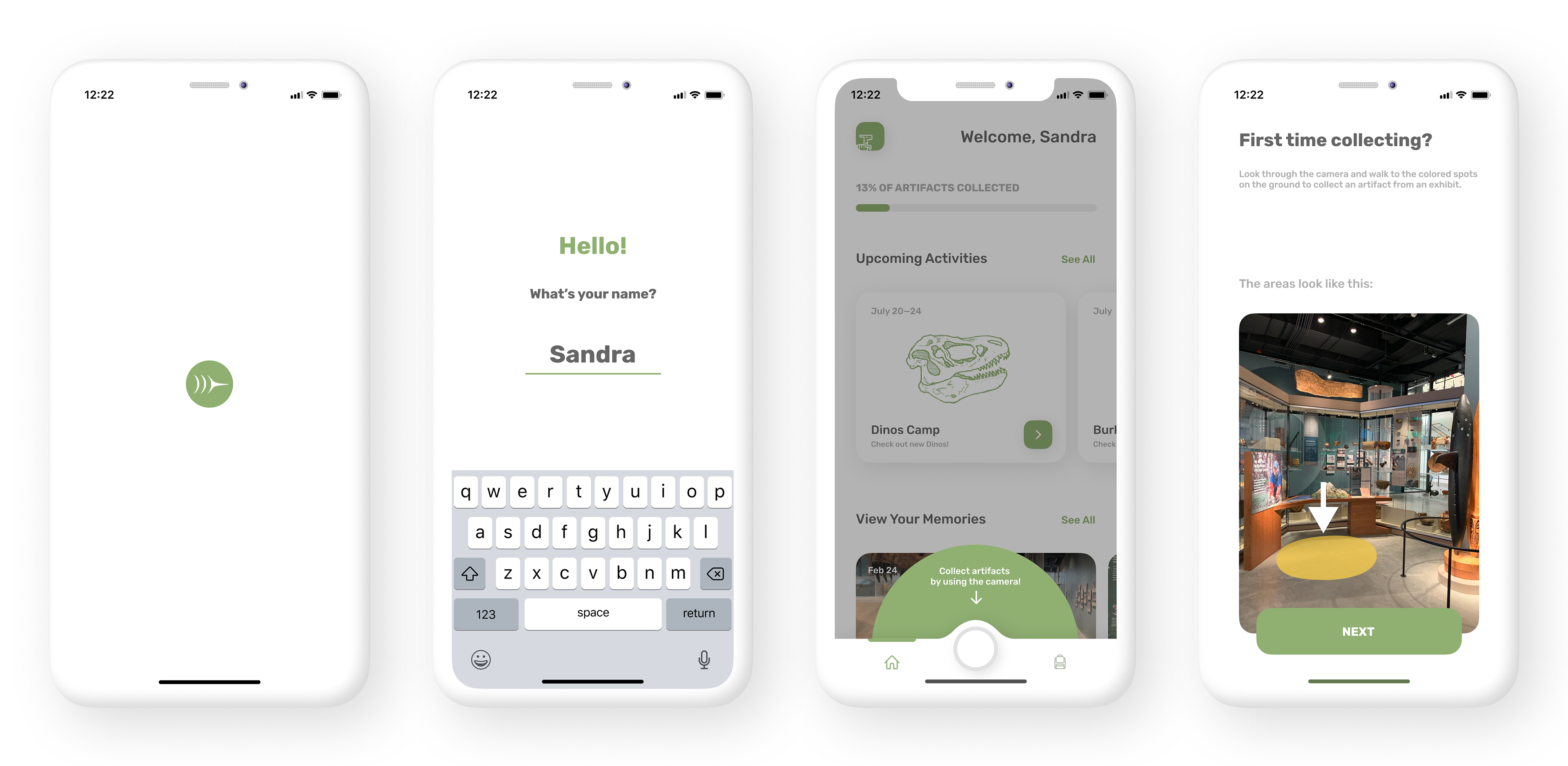
- Create an onboarding to explain the artifact collection with the camera.
Changes Made
Visual Theme:
We switched to a white background with accents of playful colors due to the overwhelming and distracting effect of the previous all green design.
We switched to a white background with accents of playful colors due to the overwhelming and distracting effect of the previous all green design.
AR Experience:
We switched from cube artifacts in the AR space to markings on the floor under each exhibit that activate the trivia process with proximity. The proximity triggers a notification that allows visitors to focus more on the museum rather than walking around constantly on their phone.
We switched from cube artifacts in the AR space to markings on the floor under each exhibit that activate the trivia process with proximity. The proximity triggers a notification that allows visitors to focus more on the museum rather than walking around constantly on their phone.
My Collections Screen:
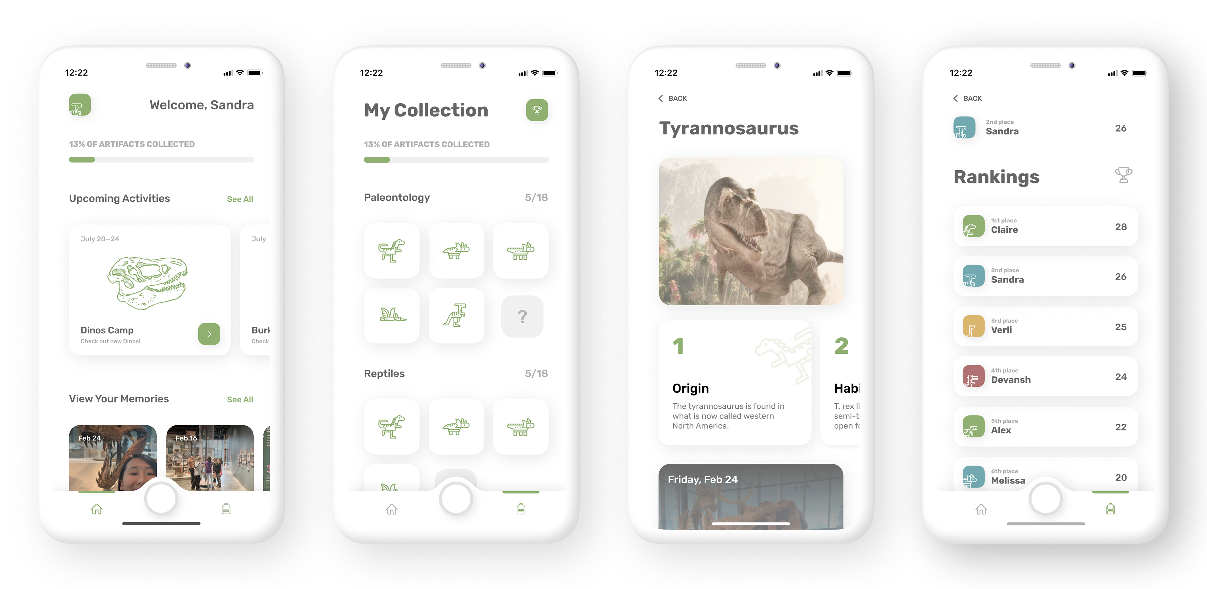
A question mark was added in each category to create mystery and incentive to reveal the next artifact.
A question mark was added in each category to create mystery and incentive to reveal the next artifact.
Navigation Bar:
We switched to a simple and constant navigation bar at the bottom that doesn't distract from the screen and is readily available unlike the two-touch process with the circle menu button.
We switched to a simple and constant navigation bar at the bottom that doesn't distract from the screen and is readily available unlike the two-touch process with the circle menu button.

Deliverable
Onboarding
When the app is first opened a series of screens shows the visitor how the AR system for finding artifacts works.
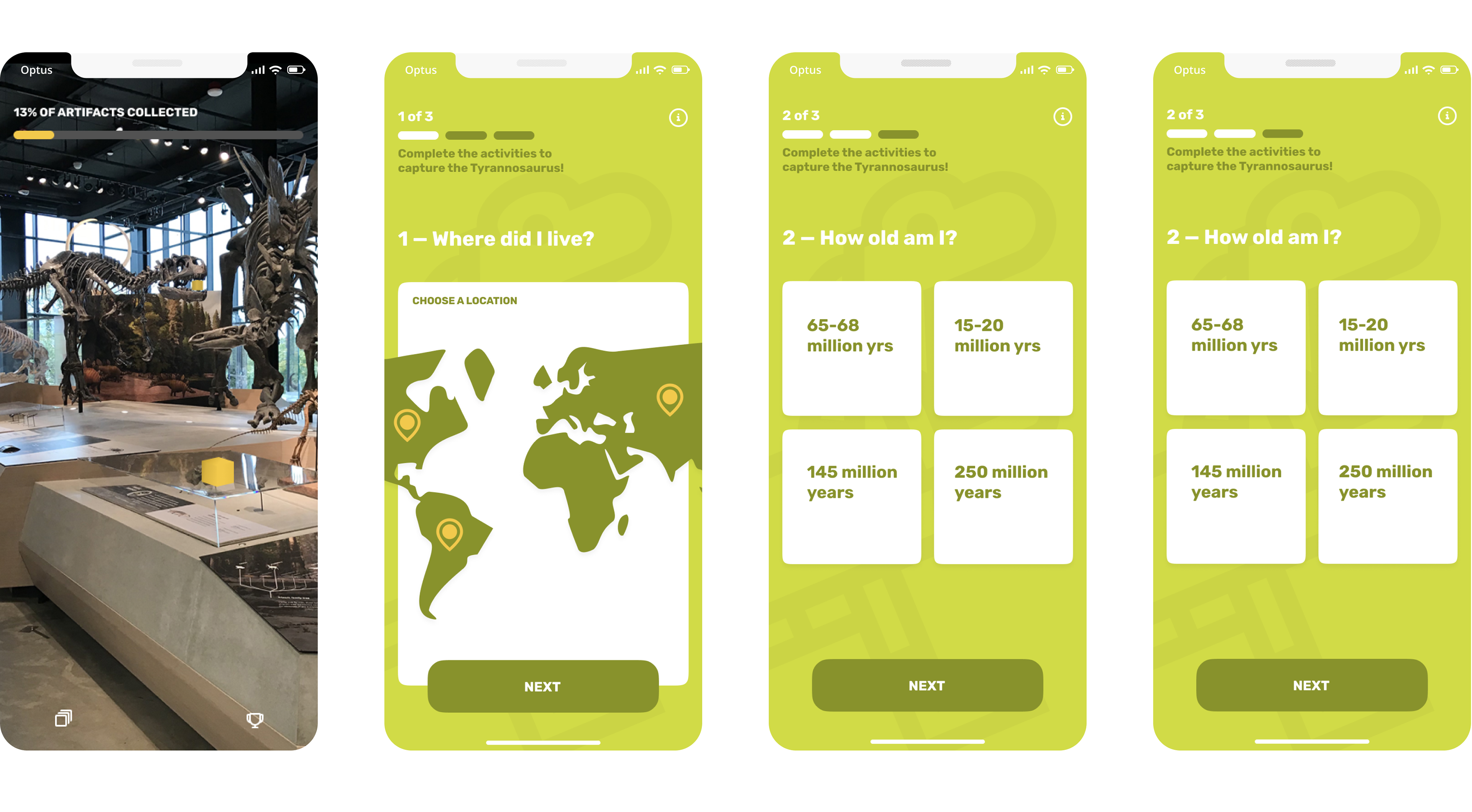
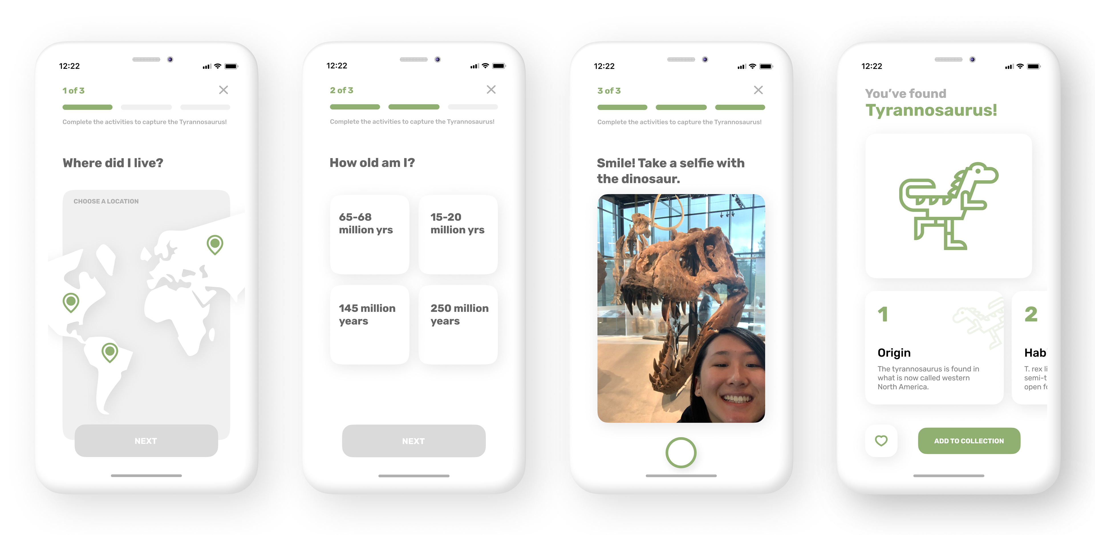
Artifact Navigation
After finding an artifact the app prompts two trivia questions in order to bring a learning aspect to the artifact collection. The selfie activity serves as a momento for each artifact.
Managing the App
The home screen prioritizes the artifact collection progress and future museum events to motivate visitors and keep them coming back. Memories are also easily accessible from the home screen to bring remembrance of how visitors felt when finding new artifacts and gaining new knowledge.
The rankings page also serves as a drive to come back to the museum by adding a small level of competitiveness.
Thank You!